")
Well, folks, it’s the end of an era. You know the iconic purple road signs that once signaled your arrival in Disney World? Well, they’re changing.
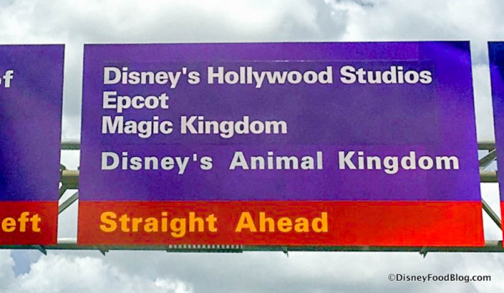
Purple Road Signs Mean You’re in Disney World!
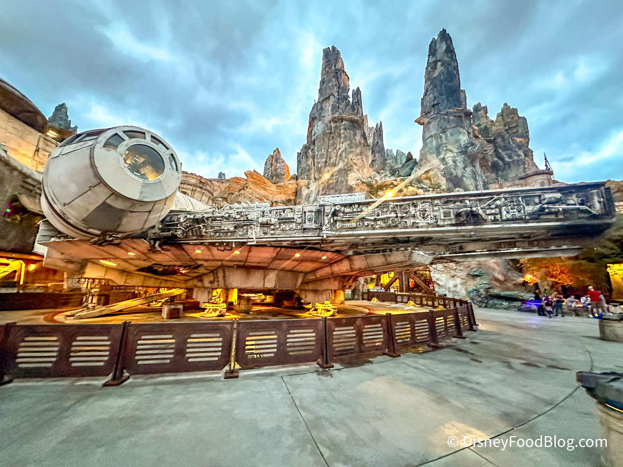
We already noticed a color change when we saw the Star Wars: Galactic Starcruiser added to an exit sign, but now the change is official, and we’ll be seeing a big roadway sign makeover in Disney World soon!
The Walt Disney World Ambassadors announced on Instagram today that all Disney World roadway signs are receiving a color makeover in the form of a bright blue and yellow color palette, inspired by the Disney World gateway sign, which was refreshed back in December 2020.
The gateway sign was repainted to this rich blue color, which will now coordinate with the new roadway sign colors. According to the Disney World Ambassadors, the new road sign colors will be rolling out throughout Disney World’s 50th anniversary celebration, which lasts until March 2023.
Disney World Entrance Gateway
So far, we’ve seen two Disney World signs changed to the new blue and yellow color scheme, so it’s only a matter of time before that iconic purple color is gone for good.
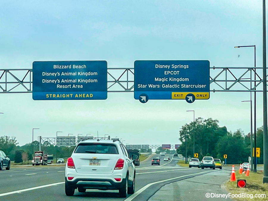
New Blue and Yellow Disney World signs!
We’ll be watching closely for more of these colorful road signs to appear around Disney World, so stay tuned to DFB for more Disney World news!
Check out the Star Wars: Galactic Starcruiser road signs here!
Join the DFB Newsletter to get all the breaking news right in your inbox! Click here to Subscribe!
WE KNOW DISNEY.
YOU CAN, TOO.

Oh boy, planning a Disney trip can be quite the adventure, and we totally get it! But fear not, dear friends, we compiled EVERYTHING you need (and the things to avoid!) to plan the ULTIMATE Disney vacation.
Whether you're a rookie or a seasoned pro, our insider tips and tricks will have you exploring the parks like never before. So come along with us, and get planning your most magical vacation ever!
What do you think of this big change? Tell us in the comments!


 Our handy (and portable!) ebook guides make sure you get the best deals and can plan a vacation of a lifetime.
Frankly, this sucks.
They look like any other road sign now ?
Boring!
New Disney Road signs now look like all the other road signs in Florida. At least this is keeping with all the other lame changes WDW is making.
Seriously? WDW is shaving costs wherever it can, reducing services and offerings, raising prices, delaying projects, and otherwise squeezing guests for money, and THIS is what’s important right now?
Those signs cost ~$25 per SQUARE FOOT!
Incredible.
Change for the sake of change equals disruption to the guest impression. Why are they throwing money away to justify the higher prices when it ain’t broke. New management is not guest focused.
Personally, I like the new signs. The purple signs were somewhat glaring to me.
Shame, I liked the old color palette, now they look boring and like anywhere else!
Another magic all gone ? We all love those purple signs . They scream “Disney vacation has started!” Yes it is horrible.
The new road signs inside Walt Disney World look just like ordinary interstate signs. The distinctive purple signs they took away were the first indication of arrival at WDW. They created excitement and were part of the “magic” as long as we were on Disney property! What “genius” decided changing to generic highway signs was a good idea?? I’ll guess it was a bean counter who wanted to save a few bucks, even though it negatively impacted the ambience that makes WDW special. Current Disney managers seem clueless because they keep taking away the magic…and pricing what’s left out of reach for average families.
The red and yellow mickey reference is gone now. I hate this. Also less visible.
Welp. That’s disappointing. I’m not a big fan of changes like that though ??
Bonehead play but not unexpected. I agree that the magic is slowly being dispersed. Those colors were burned in to our total experience, just like the Magical Express, and so many other icons that made it perfect for us for decades. Layoffs of good cast members, focusing on movies because Disney merged with non-pixie dust partners, charging more for rides, screwing up the way people move through the parks.
Walt and Marty Sklar and Roy would not do these things. Gotta revisit the benefits of my decades old DVC membership.
I think people complain about every change. There are bigger issues than sign color (eg. Genie+). I prefer the new color rather than the purple. It ties in with the anniversary and has a classier clean look. It isn’t like they have been purple forever.